Xinyun MA
Serene - Embrance Tranquilit
Package Design
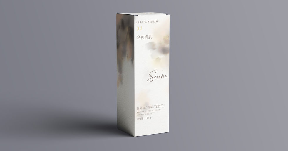
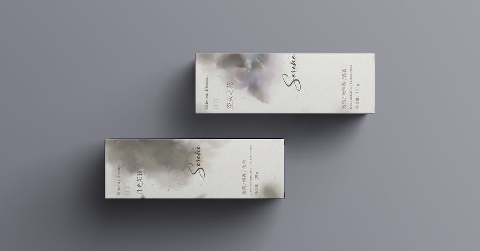
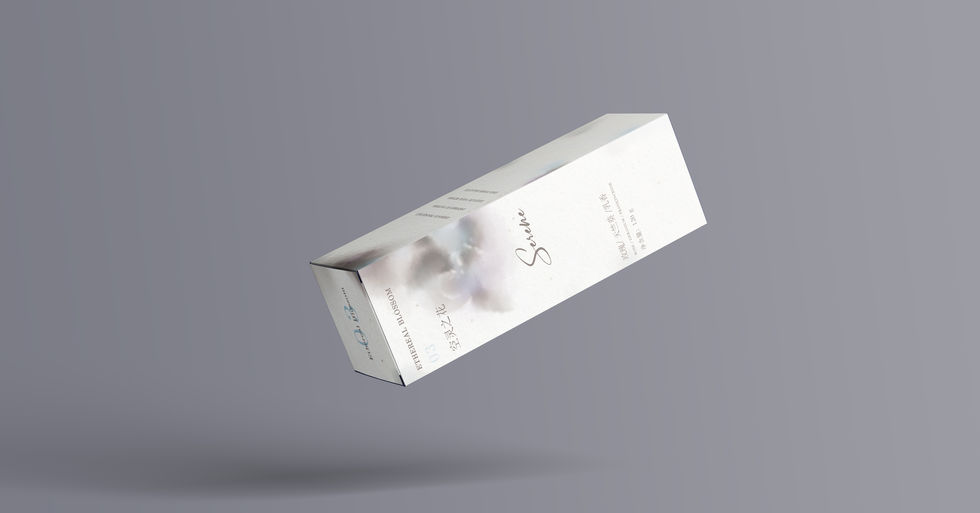
This project involves designing a packaging box for the aromatherapy brand Serene. Centered around their brand concept "Embrace Tranquility," I drew inspiration from the calming essence of scented stones. To convey this sense of serenity, I incorporated a harmonious blend of colors and ink textures into the design. Each color was carefully chosen to reflect the unique aroma of the corresponding aromatherapy scent, ensuring a cohesive sensory experience. The flowing patterns mimic the gentle, rhythmic movement of breath, creating a visual effect that evokes relaxation and calmness. This natural breathing effect aims to enhance the overall sensory experience, aligning with the brand's commitment to promoting tranquility and well-being. The result is a packaging design that not only captures the essence of Serene's aromatherapy products but also offers a visually soothing experience for the consumer.


Moonlit Jasmine
Dark Green, Earth Yellow
Golden Sunrise
Orange, Light Yellow
Ethereal Blossom
Bright Lilac, Sky Blue


